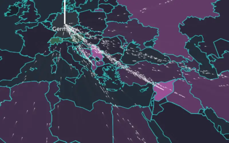
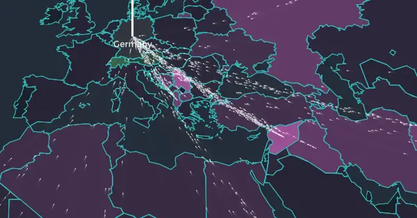
Europe is experiencing the biggest refugee crisis since World War II. The map shows the flow of asylum seekers to European countries over time.
The data from the UN refugee agency (UNHCR) publishes monthly counts of new asylum seekers for each origin-destination country pair based on information collected by the relevant agencies in the destination countries. This dataset only contains a part of the story. For example, the two million Syrian refugees in Turkey are not counted as asylum seekers, but registered refugees. While the UNHCR publishes some data about registered refugees, it is not as comprehensive as with asylum seekers.
To put the data as noble visualization Lucify teamed up with Ville Saarinen to build a novel visualisation of the European refugee crisis.
Limited by the available (reliable) data, the team has chosen to focus on the European perspective of the crisis, and show only asylum seekers arriving in Europe.
This project started with the hunch that showing each refugee as one moving dot on a map could be a powerful way to convey the magnitude of the crisis. Each pixel represents 25–50 refugees, depending on device characteristics.
The visualization does not only show the scale of the numbers, but also beautifully tells the story of what those numbers mean. The map also shows starting points and endpoints within each country, with information about how many asylum seekers have arrived in a given month.
The visualization is available as open source. The implementation involves some interesting ways to use React, D3.js and PIXI.js together.